Font Pairing Project
- Nov 9, 2016
- 3 min read


Suraya Souidi
Letterform Design
10/23
1.To create a font pairing, one must find two or more fonts that compliment each other, and are aesthetically pleasing. One font must not ‘clash’ with the others, in a way that their ‘personalities’ intertwine, to showcase a certain word or words to stand out better in comparison to others.
2. Assignment 2: This design was required to use the quotation “fly like a butterfly, sting like a bee” using a maximum of 3 fonts, in a completely black and white art board. In my design, I incorporated fonts to how I would correspond the word ‘butterfly’ into a word. I thought to use a script, handwritten-like font in order to showcase the delicacy of the butterfly. For the bee, on the other hand, I made sure to find a similar font in the handwritten aspect, but I decided to make the font more angular and jagged. The word ‘sting’ corresponded into a long, almost harsh magazine-like font that paired well with ‘float’ and ‘like a’ in both sides of the piece.
Assignment 3: This part of the project required one to take the name of a location anywhere on earth, correspond it to a high quality photograph, showcasing the location. In order to find what I felt is an essence of Paris, I used a script, handwritten font that gives off a personality of the loving air of Paris. France was used as a chunky/skinny and script/type in all caps pairing, and was not bland, including a very quirky set of lines to compliment the soft script. From the power point, I had gotten the idea previously to use either side of the sunset to show the contrasting colors, which provided an interesting composition.
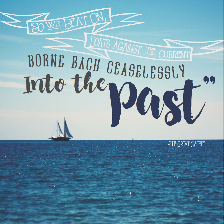
Assignment 4: For this assignment, the designer was asked to find a quotation and find a high quality photo to match. I chose a quotation from my favorite book, The Great Gatsby, and corresponded it to a peaceful scene on the water. By using a gray/white/navy color scheme, the project fit well together in a symmetrical composition. The different colors allowed for the text to pop out in their own ways, or fit well into the background to allow other words to shine through. To give it a naval feel, I added the ‘font’ of banners.
Assignment 7: The designer was asked to make a design incorporating the phrase ‘These are the good ol’ days’, making the font and background have a rustic vibe to it. I combined a script font with a serif font which both have a rugged, old feel and used the neutral color pallet to satisfy the color requirements of the piece. To tie it together, I used a tattered burlap background.
3. I feel as though my best piece was assignment 4. I chose this as my ‘best’ piece, since I had more creativity in terms of the quotation I could choose, color scheme, and background. Utilizing this freedom of choice, I feel as though I did well in accomplishing what the project required and went far above the requirements asked of me.
4. I believe that my weakest font pairing was assignment 3. I feel as though it is very plain, and there is not much that I can do to make the composition or font pairing itself that interesting. I felt very bound by the restrictions and rules given.
5. I would describe the font pairing process as something that you just feel inside of you. You have to know in your heart that some fonts go along with others, and what may be aesthetically pleasing to the viewer outside of yourself. I don’t find this project to be difficult, but rather very interesting and a good and simple segue into possibly harder topics of the year. I find it to be fundamental to the rest of the year.


Comments