Ligature Logo Project
- Nov 29, 2016
- 2 min read


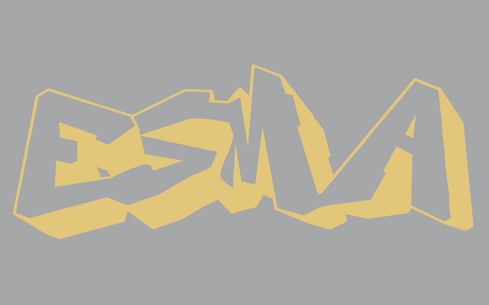
1. A ligature logo is a design, with words, which emulates the company’s corporate identity through things such as font choices and color to paint a picture about what the company stands for.
2. -hip
-modern
-clean
-urban
-youthful
3. I feel as though my first logo, with the rounded font and large M in the center, is my strongest. I believe that it incorporates all 5, if not more, of the words used to describe Esma and what it stands for as a company. It is clean, meaning it does not have too much going on, which focuses on the letters, and it also looks modern and trendy because of the curved lines and the grouped lines at the bottom, which even out the emphasized ‘M’.
4. I would have used only one defining color in order to make the logo more minimalistic and give it a truly modern feel, but I would have left the project the same otherwise, since I would still be working towards making the identity for the company, and not for myself.
5. In my first logo, I used bottom shared stroke to connect the E to the S, as well as top shared stoke for the S, M and A. Additionally, I used the technique of cutting off a stroke to connect the top of the A to make it a shared stroke. In my second logo I used a bottom shared stroke for the E and S, broke off a part of the M to attach the S to the top of the M while leaving the bottom still intact, and attached the A by building bridges with the drop shadow in the back and sharing the bottom stroke.


Comments